
Beth brochure
Graphic Design
Details
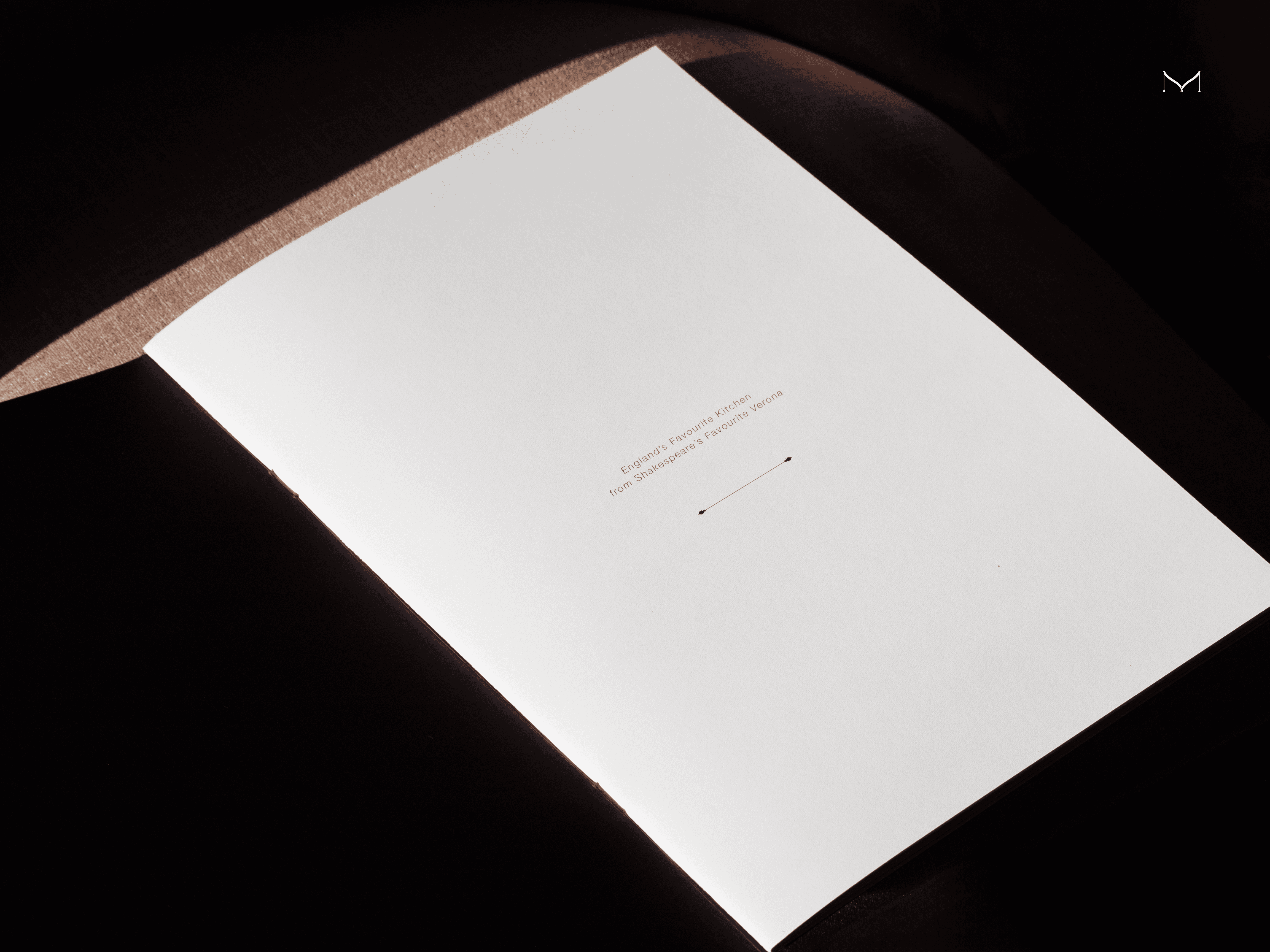
The Beth brochure was born from a deep exploration of cultural aesthetics, artisanal traditions, and contemporary design communication. This project sought not only to present a luxury kitchen collection, but to convey a refined lifestyle — where the quiet sophistication of English interiors meets the precision and warmth of Italian artisanal excellence.
Services
Art Direction
Graphic Design
Year
2024


Our research journey began with a study of early English cabinetry, Georgian symmetry, and the enduring appeal of country manor kitchens — translating these visual codes into a modern language of elegance. We paired these insights with the heritage of Italian craftsmanship, rooted in bespoke, handmade processes and an inherent reverence for materials. The result is a visual and narrative experience that speaks to both legacy and innovation.


The design of the brochure reflects this duality: classic serif typography, editorial-style layouts, and a muted, harmonious color palette echo the English influence, while the clarity of structure, focus on material textures, and refined pacing channel the quiet confidence of Italian design. Every page invites the viewer into a home — not just a kitchen — where function is shaped by emotion, and design becomes an extension of identity.
Created in close collaboration with Martini Interiors, the Beth brochure is more than a marketing tool. It is a brand statement—curated for clients who value narrative, beauty, and the subtle power of tailored design.

Credits
Creative Direction
Martini Interiors
Maria Martynova
Graphic Design
Maria Martynova
